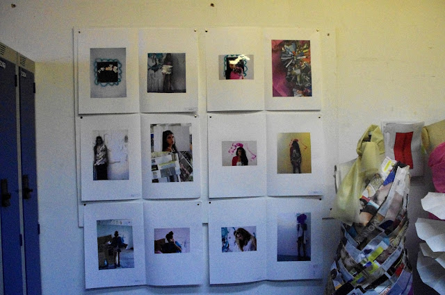
The first year fashion cluster included a six week project where we had to create a magazine as part of a group. I took on role as Editor and was responsible for the coordination and running of the magazine.
The theme of our magazine was monarchy which run consistently throughout every aspect of the magazine. Our brief was to create a magazine influenced by 'POP' magazine so we included fun, colourful and unusual approach to the layout and content of our magazine.
Front cover
 |
Front cover of 'A' magazine
|
For the Front cover we decided to portray the idea of a playing card- in particular 'A' because it is the top card and reigns superiority over the others.
Advert


Initially we had planned for our advert to have a rich gold colour for our advert but financially it was out of reach. The plain white background was still effective as it creates a clean and eye catching statement about the university.
Editors letter
 |
| Editors letter |
The editors note really just introduces the content of the magazine in a informal and alternative style.
Contributors page
 |
| Contributors page |
For the contributors page again we took a royal approach and used stamps silhouettes to introduce the contributors of the magazine.
Contributors: Charlotte Roberts
Bethany Celosse
Tamara Turnbull
Zoe Wiszniewska
Calum Buchan
Jennifer Fearn
Clara Doehl
Ceara Watson
Katherine Kelly
Evangeline Tee
Feature 1
  |
| Royal Rejects |
For our first feature we decided to write to some celebrities whom are seen to be royal in the public eyes.
We wanted to see how gracious they would be in their replies and if they would even take the time to reply. We decided to go to the head of aristocracy by asking the queen herself and actually got a reply which was unexpected.
Photoshoot 1
 |
| Purple reign |
Since we had already decided one of our photo shoots was going to be incredibly lavish and over the top we decided to have something completely different for the second shoot. We decided the styling should be a bit more contemporary and modern with the use of bright acid colours featuring the use of metallic.
A kaleidoscope effect was used as it related to the theme of royalty since many stain glass windows have regal content and we really liked the repeat Patten that can be created. A juxtaposition effect can then be created by having the very rich and sophisticated feel for the second shoot.
The colours and editing style also help to highlight the influence of POP magazine as they are so new and extravagant.
Photoshoot 2
For our second shoot 'play for power' we decided to really highlight the theme with the use of regal colours and textures. To relate to POP we incorporated the idea of having a power struggle and to create more of a threatening and violent feel with the use of bruise make up to reflect the couples strive for superiority.
Interview 1

 |
| Jett Sweeny (Queen of high street) |
Jett Sweeney, the assistant designer of H and M, agreed to an chat with us. In the interview we wanted to stay consistent with style of POP magazine with fun and unusual questions about how she personally felt regal.
Interview 2

 |
Drag Queen (Don't be a drag just be a Queen)
|
POP can sometimes be very over the top and extravagant with bold content and interviews so we decided to interview someone with a glitzy and glamorous lifestyle. The Queen's of theatre really know how to put on a good show and how to shock their audiences which is exactly what happened in our interview.
Feature 2

 |
| Welcome to the kingdom |
|
|
The final feature 'Welcome to the kingdom' is a map to all the regal places in Edinburgh and the borders where you can feel like part of royalty and really indulge yourself in your surroundings.
Back page
The pack page illustrates the different front covers available with the regal edition of the magazine in a similar style to POP as the reader has the option to pick the cover they like best. Creating more variety and choice for the reader.
What we would have done differently...
Overall we were all very happy with the way our magazine turned out and if we were given the option we would have added more pictures and expanded on our content. Specifically we would have wanted to include the full letter from her majesty which can be seen below.

|
|
As Heriot Watt has strong links with Central St Martins we were able to have a guest lecturer Hywel Davies come and speak to us about the initial thoughts for our magazine and to asses our final outcome.
Hywel gave us some positive feedback and stated he would 'pick up our magazine' which was encouraging to hear.
I can honestly say I loved my group and the project so cant wait to start fashion communication in 2nd year.
Love X


